
In today’s digital age, where more and more people are accessing websites from their mobile devices, having a mobile-friendly website is not just an option but a necessity. Your website’s design and functionality play a crucial role in attracting and retaining visitors. That’s where the choice of your mobile friendly WordPress themes comes into play. Selecting the right theme for your website is a decision that can significantly impact your online presence. The themes we’ve curated in this article are not only visually stunning but also highly responsive, versatile, and user-friendly.
Our selection criteria encompass a variety of factors, including design quality, flexibility, responsiveness, and user reviews. We understand the importance of a seamless user experience on both desktop and mobile platforms, and the themes we’ve chosen excel in this regard. Whether you’re setting up a personal blog, an e-commerce store, or a corporate website, these themes offer the adaptability and performance needed to shine in the mobile world.
Let’s dive into the world of mobile-friendly WordPress themes that not only meet the criteria but surpass them. We’ve handpicked 15 themes, each showcasing unique features and design elements that make them stand out in the crowded theme market.
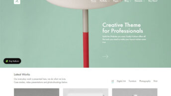
The7
The7 is a versatile and highly customizable WordPress theme that’s perfect for a wide range of websites. Its standout feature is the ability to create stunning designs with its integrated Visual Composer and Ultimate Addons for Visual Composer. With 48+ pre-made website designs, The7 makes it easy to get started. Its responsive design ensures that your site looks fantastic on mobile devices, providing an exceptional user experience.
This theme’s key strengths include its deep integration with WooCommerce for e-commerce functionality, its SEO optimization for better visibility in search engines, and its user-friendly interface. Whether you’re running a blog, a business website, or an online store, The7 offers a mobile-friendly solution that’s both powerful and easy to use.
DOWNLOAD / DEMOBeTheme
BeTheme is another impressive WordPress theme that’s all about flexibility and functionality. It boasts an extensive library of pre-built websites, each tailored to a specific niche or purpose. With one-click installation, you can have your website up and running in no time. BeTheme’s responsive design ensures that your content looks great on any device, and its user-friendly interface makes customization a breeze.
Whether you’re creating a portfolio, a blog, or an e-commerce site, BeTheme provides the tools and design options you need. It also includes the popular WPBakery Page Builder for easy content creation and customization. BeTheme’s versatility and mobile-friendliness make it an excellent choice for various types of websites.
DOWNLOAD / DEMOFlatsome
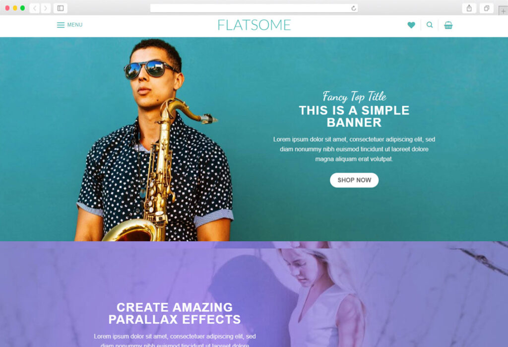
Flatsome is a dedicated e-commerce theme known for its exceptional responsiveness and design quality. If you’re looking to set up an online store, Flatsome should be at the top of your list. Its mobile-optimized design ensures that your products shine on smartphones and tablets.
With Flatsome, you get a range of customization options to make your store unique. The built-in drag-and-drop builder allows you to create your layouts effortlessly. It also integrates seamlessly with WooCommerce, offering features like a quick view, product variations, and a responsive product grid.
Flatsome’s user-friendly interface, excellent e-commerce integration, and mobile responsiveness make it a standout choice for those looking to create a mobile-friendly online store.
DOWNLOAD / DEMOImpreza

Impreza is a theme that combines simplicity with robust features, making it ideal for various types of websites. With its mobile-responsive design, your content will look fantastic on any device. Impreza comes with a built-in drag-and-drop builder and over 14 different portfolio layouts, making it a great choice for creative professionals and agencies.
The theme also offers SEO optimization and a user-friendly interface, allowing you to build a website that’s not only visually appealing but also highly functional. Whether you’re a freelancer showcasing your work or a small business owner promoting your products, Impreza has the tools and design elements you need.
DOWNLOAD / DEMONewspaper

Newspaper is a theme designed for content-driven websites, such as blogs and news sites. Its responsive design ensures that your articles and stories look great on mobile devices, making it a top choice for publishers. This theme offers a vast range of customization options, including a tagDiv Composer for creating unique page layouts.
With SEO optimization in mind, Newspaper is designed to improve your website’s visibility in search engine results. It’s also integrated with WooCommerce for those looking to monetize their content through e-commerce. Whether you’re a blogger, journalist, or aspiring writer, Newspaper is a mobile-friendly choice that puts your content in the spotlight.
DOWNLOAD / DEMOPorto

Porto is a powerful and versatile theme built with e-commerce in mind. Its mobile-responsive design guarantees that your online store will be accessible to customers on the go. Porto offers over 30 demo templates for various industries, making it easy to get started with your online shop.
This theme’s key strengths include a user-friendly admin panel, quick product search, and multiple header styles. It integrates seamlessly with WooCommerce, providing e-commerce features like product comparisons, wish lists, and zoom effects. If you’re looking to set up a mobile-friendly online store that not only looks great but also functions seamlessly, Porto is an excellent choice.
DOWNLOAD / DEMOWoodMart
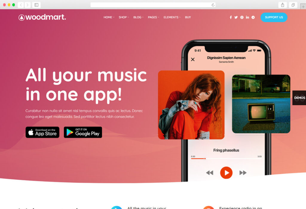
WoodMart is a WordPress theme tailored for e-commerce websites. With a mobile-friendly design, it ensures that your products and storefront will shine on mobile devices. WoodMart offers a variety of pre-designed store templates, making it simple to launch your online shop.
This theme’s key strengths include its integration with WooCommerce, allowing you to create a powerful online store, and its user-friendly interface for easy customization. WoodMart also provides options for product quick view, AJAX shopping cart, and filters. Whether you’re selling fashion, electronics, or any other products online, WoodMart is a mobile-friendly theme that will help you boost your e-commerce business.
DOWNLOAD / DEMOuDesign
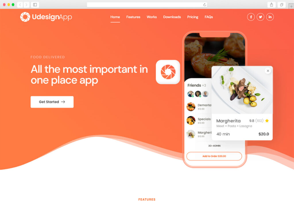
uDesign is a versatile and mobile-responsive WordPress theme suitable for a wide range of website types. It offers a variety of design customization options, including a drag-and-drop page builder, making it easy for you to create your ideal website.
With uDesign, you have access to over 2,000 fonts and unlimited color options, allowing for complete creative freedom. It’s also SEO optimized for better visibility in search engines and has a user-friendly admin panel. Whether you’re a small business owner, blogger, or creative professional, uDesign provides the tools and flexibility to create a mobile-friendly website that suits your unique needs.
DOWNLOAD / DEMOKALLYAS

KALLYAS is a responsive and highly customizable WordPress theme that caters to diverse website types. With over 70 pre-designed templates, it’s easy to find a look that suits your project. KALLYAS also comes with a drag-and-drop page builder, enabling you to craft unique layouts effortlessly.
This theme’s key strengths include its SEO optimization, user-friendly interface, and integration with WooCommerce for e-commerce functionality. Whether you’re starting a blog, a portfolio, or an online store, KALLYAS offers a mobile-friendly solution with the adaptability and performance required to succeed in the digital landscape.
DOWNLOAD / DEMOBrooklyn

Brooklyn is a versatile and responsive WordPress theme that’s perfect for creative professionals and small businesses. Its mobile-friendly design ensures that your website looks great on smartphones and tablets. Brooklyn offers a range of customization options, including a powerful page builder and multiple pre-built demos tailored to different industries.
This theme’s key strengths include its user-friendly interface, seamless integration with WooCommerce for e-commerce functionality, and a variety of portfolio styles for showcasing your work. Whether you’re a designer, photographer, or a small business owner, Brooklyn provides a mobile-friendly solution to create an attractive and functional website.
DOWNLOAD / DEMOXStore

XStore is a dedicated e-commerce WordPress theme with a focus on mobile responsiveness and versatility. It’s designed to help you set up a mobile-friendly online store that performs exceptionally well on all devices. XStore offers a broad range of pre-designed templates and customization options to make your store unique.
Key strengths of XStore include deep integration with WooCommerce, allowing you to manage your products with ease, and a user-friendly interface for effortless customization. Whether you’re selling fashion, electronics, or any other products online, XStore is a mobile-friendly theme that will enhance your e-commerce venture.
DOWNLOAD / DEMOShopkeeper

Shopkeeper is another excellent choice for e-commerce websites, with a strong emphasis on mobile responsiveness and flexibility. Its design ensures that your products are presented beautifully on mobile devices. Shopkeeper comes with an integrated page builder for easy customization and provides various pre-built templates for a quick start.
This theme’s key strengths include its seamless integration with WooCommerce for a comprehensive e-commerce experience, SEO optimization for better search engine visibility, and a user-friendly admin panel. Whether you’re setting up a mobile-friendly online store for the first time or looking to enhance your existing shop, Shopkeeper offers the tools and features you need.
DOWNLOAD / DEMOStockholm

Stockholm is a versatile and mobile-responsive WordPress theme that caters to a wide range of website types. With its clean and modern design, it’s ideal for creative professionals, agencies, and businesses. Stockholm provides a drag-and-drop builder for effortless customization and offers numerous pre-made templates.
Key strengths of Stockholm include SEO optimization for improved search engine rankings, user-friendly features, and a variety of portfolio styles for showcasing your work or products. Whether you’re a freelancer, agency, or business owner, Stockholm offers a mobile-friendly solution that combines aesthetics and functionality.
DOWNLOAD / DEMORonneby

Ronneby is a responsive and highly customizable WordPress theme suitable for a variety of website types. Its mobile-friendly design ensures that your website looks stunning on any device. Ronneby comes with a user-friendly admin panel, making it easy to customize your site to your liking.
This theme’s key strengths include SEO optimization for better visibility in search engine results, integration with WooCommerce for e-commerce functionality, and a range of customization options. Whether you’re running a blog, a business site, or an online store, Ronneby offers the adaptability and performance needed to create a mobile-friendly website that suits your unique needs.
DOWNLOAD / DEMOKLEO
KLEO is a responsive and versatile WordPress theme that’s perfect for a variety of website types. Its mobile-friendly design ensures that your website is accessible to users on mobile devices. KLEO offers a wide range of customization options, including the Visual Composer page builder.
Key strengths of KLEO include its compatibility with popular plugins like BuddyPress and WooCommerce, making it an excellent choice for community or e-commerce websites. It’s also SEO optimized for better search engine rankings and has a user-friendly admin interface. Whether you’re building a community platform or an online store, KLEO provides the tools and flexibility to create a mobile-friendly website that suits your needs.
DOWNLOAD / DEMOIn this article, we’ve explored a diverse collection of 15 mobile-friendly WordPress themes, each offering unique features and design elements to cater to various website types and purposes. From e-commerce stores to creative portfolios and content-driven blogs, these themes ensure that your website is not only visually appealing but also responsive and user-friendly. Choose the one that best fits your project, and start creating a mobile-friendly online presence that captivates your audience.